
The Desmoid Tumour Foundation of Canada (DFC), founded in 2016, is a registered Canadian charity dedicated to funding research for a cure for desmoid tumours. Desmoid tumours are locally aggressive soft tissue tumours (also known as “agressive fibromatosis” or “desmoid-type fibromatosis”) that affect 2-4 people in 1 million every year. The Desmoid Tumour Foundation of Canada is the only Canadian foundation dedicated to funding desmoid tumour research and finding a cure for this rare disease.

When the client’s original website was created, they had just be founded as a charity. Over the years, their needs had expanded and their website no longer communicated everything that they needed to communicate to desmoid patients and potential supporters. The client required a way to easily update information to share stories about research and studies, to better promote fundraising efforts and events, and to connect with users who would like to remain in contact with them. In addition to this, the client was finding that the WordPress interface was difficult to make updates on.

The client originally hosted their website on WordPress.com, which didn’t allow for the customization that the client required. We moved the website to a self-hosted WordPress installation, with page builder support that allowed for drag and drop page elements where desired.
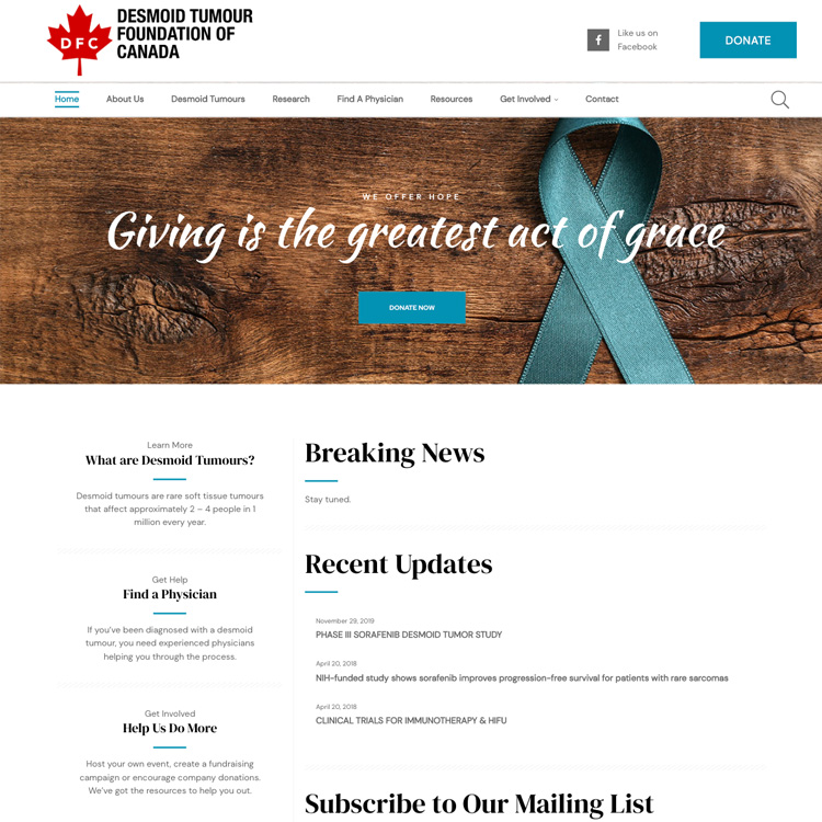
We worked with the client to simplify the front page of the website, looking at exactly what someone visiting their website would be looking for, and provided an easy way to keep breaking news included on the front page when required. The new home page was more direct and welcoming, and made it easy for a new visitor to find what they were looking for.
One of the client’s big fundraising efforts every year was a gala with a silent auction. The client required some custom page builder elements developed specifically to handle the silent and live auction items. We developed these for the client so they could easily input items and rearrange them as required.

The client ended up finding the new website was much easier to use, with website visitors and views tripling over the average website visitors and views from the previous 6 months.

We like to talk strategy. A lot.
We’d love to hear about your current and upcoming projects to help you put a plan that works for you into place.
We like to talk strategy. A lot.
We’d love to hear about your current and upcoming projects to help you put a plan that works for you into place.